E-commerce Website (Upcoming)

This E-Commerce Website is a project composed of Front-End Development, Back-End Development, Google Cloud Platform, and Machine Learning. Front-End Development was first developed using HTML, Javascript, CSS with Bootstrap and JQuery. Back-End Development was done with Python Flask to connect with Google Cloud Platform to send and receive information. The website was recreated with React. Within Google Cloud Platform, Amazon Dataset was imported and is stored in Google Stoarge and are trained on monthly batch of 1 month.

project_info

Medicare Fraud Detection

In this project, I would like to discover the physicians that are likely to commit fraud based on the 2013 U.S. Physician and Other Suppliers Dataset and Part D Prescriber Dataset.  I am going to build a machine learning model that can detect the anomaly patterns in Medicare payments and be able to predict frauds in the future. These datasets are not labelled, so I need to search for the domain knowledge and background information in order to complete this project.

Congressman of Illinois at the time was Peter Roskam, who heavily considered the importance of detecting the Medicare fraud. On this link, the article mentions that the previous congressman said: “Worldwide credit card transactions, the credit card fraud rate is 0.04 percent, compared to almost 8 percent, 9 percent, 10 percent of Medicare Fraud.” These numbers are cited from two different governmental reports, which includes Government Accountability Office report and the U.S. Administration on Aging. Using these information, I am going to assume that the fraud rate percentage is between 8 to 10 percent.

Data Preprocessing:


There are 27 columns for the provider table and 20 columns for prescriber table. Provider table is the services provided by the individual physicians and prescriber table is the drugs prescribed by the physician.  First thing I want to do is to select the columns that are important and rename them to something more familiar. The next step for me is to create new features like payments, which is average_payment * service_provided. Then I want to aggregate the data based on npi (physician ID) as well as eliminating the physicians who did not participate in Medicare. Also, I did not include the physicians who are defined as an organization. I now want to do the same thing for the prescriber table.

Screen Shot 2018-09-20 at 8.30.35 PM.png

I will now join the two tables based on npi (physician ID). With all the aggregated data from both tables, I can now reduce the total columns of 47 columns to 24 columns. I have to make sure that the columns I use are relevant to the methods I am going to use to detect the fraud.

The four methods I will be using to detect the fraud are

  • Rule-Based (SQL)
  • K-Means
  • Isolation Forest
  • OneClass SVM

Rule-Based:

The first technique I am going to use is making a rule-based system, which is one of the oldest computer science technologies being used today. A lot of firms still use the rule-based system to solve problems and it is important to only include the rules that can clearly define the target you are solving for. Rather than defining the fraud with this method, I will use the analysis to compare to other algorithms I apply.

As mentioned above, I am going to predict that the Medicare fraud rate is 8 %. With this information, we can use window function to find out the physicians who have top 8% in each provider type. Window function will be further discussed in my next post.

Screen Shot 2018-09-20 at 9.40.25 PM.png

K-Means:

K-Means Clustering is an unsupervised machine learning method, which can group k number of clusters in order based on its feature similarity. Before proceeding to K-Means, there are several steps I need to take. Since the size of the data is more than 500 thousand rows, we have to get a sample of the data to reduce the time it takes to run the model. I am going to use 10% of the data as it seems reasonable and I can still maintain enough data to run the model. I will then scale the data and apply PCA to reduce the dimensionality as I have more than 20 features and the variance is comparably high.

Screen Shot 2018-09-24 at 10.46.50 AM.png

The next step is to find the k number in order to determine how many clusters I want to make. The method I am going to use to define it is the elbow curve. The elbow curve generally shows the relationship between the number of clusters and the distortion. As you can see from the graph below, we can see the efficiency of creating another cluster decreases when the k value is 4.

Now that we have the k value, we can proceed to make the K-Means with the k value of 4. If we plot out the K-Means, it does not look as clear as average K-Means clusters we are more familiar with. This is due to the feature scaling and PCA we have applied before making the clusters.

Screen Shot 2018-09-24 at 10.53.16 AM

Now that I have the clusters, how should I detect the outliers? The way I am going to do this is setting the variables that are far away from the centroids within each cluster as outliers.  In order to do this, we need to find the centroid of each cluster, then get the distance of each variable from the centroid and set a threshold so that if the distance is farther than what we set it to be, we can outline those values as outliers. The threshold I have used is 8%, which means all the variables that are top 8% farthest from the centroid will be labeled as frauds. Analysis of this will be covered after the explanation of Isolation Forest and One Class SVM.

Other Techniques:

There are two other techniques I want to share which can also detect frauds, which are Isolation Forest and One Class SVM. Isolation Forest basically isolates observations by randomly selecting a feature and selects a split value between the maximum and minimum values of the selected feature. One Class SVM learns a decision function for novelty detection, which classifies new data as similar or different to the training set. For both cases, I set the outlier fraction to 8% to be consistent.

Screen Shot 2018-09-24 at 2.08.16 PM.png

As you can see, all three of the algorithms have similar characteristics in terms of the payments, gender, and the drug costs. The physicians who committed frauds have higher average payments and average total drug costs compared to those who didn’t. Also, the gender ratio seems to be biased towards male, which can also relate to the rule-based system with higher percentage ratio for male. It is interesting to see how they provide similar characteristics despite using different algorithms. We should also consider the location as it is extremely important if we want to detect where they come from.

MAP.png

Screen Shot 2018-09-24 at 2.15.28 PM.png

After analyzing where the frauds were committed, I was able to find which states cause them the most. With the combination of all 4 methods including rule-based, K-Means, Isolation Forest and One Class SVM, top 3 states that has most fraud counts are California, Florida, and Texas. One thing to mention, the count of K-Means clustering is about 10 times smaller because I sampled the data to 10% as mentioned previously.

Conclusion:

One thing I can conclude is that it was interesting to find out different ways of detecting fraud despite having labels on them. Of course, it is not dependable and accurate compared to the labeled data, but it can still provide some key insights and have some impacts on future prevention. Thank you for taking your time to read this blog!

Bank Loan Default Prediction

In today’s world, there is an increasing number of people who are looking to borrow money from banks. Unfortunately, there are also a lot of people who cannot afford to pay the money back. Loan default is one of the most critical factors that banks concern and that needs to be resolved. In order to reduce this problem, it is necessary to find out which type of people will likely default. I am going to use the bank dataset collected in 1999. It consists of 8 tables, which the status of the loan is described in the loan table.

Picture1

Data Exploration:

Screen Shot 2018-09-13 at 9.34.35 PM.png

To briefly discuss the loan status, the status column consists of 4 letters, which B as being default and A, C and D as not defaulting. According to the description of the label, A and C are stated as OK and no problem whether their contract finished or not. I also included D as not default, because the contract is not finished even though the client is in debt. However, it is clear to label B as default since they have not paid their loans despite the contract having to finish.

Screen Shot 2018-09-13 at 10.05.40 PM.png

As for the gender column in the Client table, the gender is differentiated by their date of birth column in the same table. If the month on their date of birth is unusually big, it means that they are female as the format for the female’s birthdate is YY(MM+50)DD. To simplify this, we can say that if the month of the birthdate is greater than 12, then it is a female.
Other important information we need to consider is that there are 5369 distinct client_ids, 4500 distinct account_ids, and 682 loan_ids. As our final goal is to find out the clients that will default, it would be efficient to base everything on the loan table. In the end, our final table will consist of 682 rows with 682 loan_ids.

Data Preprocessing:

As mentioned in the data exploration section, I would like to aggregate the data based on loan_id, which is the account holders who borrowed money from the bank. So the purpose is to predict client’s behaviors about the loan for each account.

In order to use the categorical variables, I need to convert it to numerical values in order to apply the features on to the machine learning models. It can be done in Python as well, but I chose to do this on SQL in this project. After that, I left join all the tables there are on to loan_id in loan table.

Screen Shot 2018-09-16 at 10.45.28 PM.png

As there are missing values in 6 different columns, we need to use Python to do some feature engineering to resolve this.  In this case, I have used fillna() function to fill in the null values to zero and median values according to its characteristics.

Model Selection:

Screen Shot 2018-09-16 at 11.31.43 PM

After joining the table, we can determine the number of clients who have gone default. As you can see on the bar graph, there is a significant difference in terms of how many clients who have gone default and who did not. In this case, the overall accuracy score can have high numbers, but it will have a lower f1 score. It is crucial for us to consider the f1score if we are dealing with cases like default, churns, and fraud detection cases. The f1 score determines both precision and recall, which means it will consider all the cases where we have thought the client went default but did not and the client’s that we have missed to label as default that actually did. One of the ways to resolve this problem is oversampling the minority class so that the result is not biased.

ROC.png


The machine learning algorithms I have used for these are Logistic Regression, SVC, Gradient Boosting, and Random Forest. I plotted these models for the ROC curve to calculate the AUC score. The best AUC score from the four models is Random Forest. Not only does Random Forest has the highest AUC score, it has an advantage of depicting important features.

Feature Selection:

download (1)

Screen Shot 2018-09-17 at 12.00.13 AMTop 5 features according to the graphs are loan_payment, maximum_trans_balance, issuance_after_transaction, and loan_amount. As you can see in the bar graph, the maximum transaction balance is higher and the minimum transaction balance is lower for the clients who are defaulted.


Conclusion:

In this project, I have experienced with handling an imbalanced dataset, which I have applied the oversampling technique to reduce the bias. After that, I found out that the most suited algorithm is Random Forest, which I have the highest accuracy as well as the f1 score. It is crucial for the banks to detect the default behaviours in the early stages and consider all the situations where it may cause the possible losses for the bank.  I hope to dig deeper into this project by applying more algorithms and looking into more features.

Screen Shot 2018-09-11 at 11.21.10 AM

In today’s society, many of the millennial condo buyers use the internet websites to gather information and make comparisons on which condo they would like to purchase. However, it can be complicated and struggling for new users who are using their website as they need to input and consider a variety of factors before they proceed to search for their desired condo. I came along with an idea to create a suggestion map to use Google Maps to search for the condominium suite to meet the user’s demands.

Data Scraping:

Picture1

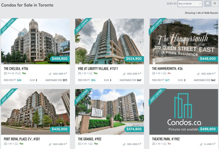
My first task in this project is to collect the data from a condominium website called Condos.ca to extract all the necessary information to create a map. I am using a Python package called BeautifulSoup in order to parse HTML pages from the website. I have collected the data from each individual regions in the GTA area, which the user is given an option to input the minimum and maximum price as well as the region they are looking for. Other processes required to do this is making functions to check the next condo posting within the list and checking if the next page exists at the end of the page. I will store all the information I collect to dictionaries and append them to a list to import them into a data frame.


Data Cleaning:

My next step is to clean the data, so the format is organized and easy to read. Cleaning data involves putting the dollar signs in front of price columns, filling in the missing value and removing the features where there is an insufficient information. As shown in the table below, the features that will be included in the marker include area, number of bedrooms, address and price.

Screen Shot 2018-09-11 at 11.24.03 AM.png

Screen Shot 2018-09-11 at 10.02.12 AM.png

Before moving on to visualizing the data, I need to find out the geographic coordinates in order to plot them. I came across the package called GoogleV3 from geopy.geocoders, which uses Google API to convert the following addresses to geocoders. Then, I will save the latitudes and longitudes to nested lists for later use.

Screen Shot 2018-09-23 at 11.05.06 PM.png


Data Visualization:

Now let’s move on to what type of maps we want to make. The maps I thought were interesting that I decided to do are heatmap and marker map.

The heat map will point out the condo suites that have not been sold for a long time to determine the areas that the users would like to avoid when they are looking for their condo.

Screen Shot 2018-09-11 at 9.00.12 AM

To find this out, I need to differentiate the condos that have been on the market up to 20 days, between 21 to 40 days and over 40 days. I am using for-loop to assign colors to each section and plotting them on to a pie chart using the library called matplotlib. There is a higher percentage of condos that have been on market for less than 21 days, whereas there are fewer condos that have not been sold for over 40 days.

Furthermore, using Google API using gmaps library, I am able to plot the coordinates according to the list of old condos that I have gathered. The center point coordinate will be the first location within the list.

Screen Shot 2018-09-23 at 11.08.42 PM.png

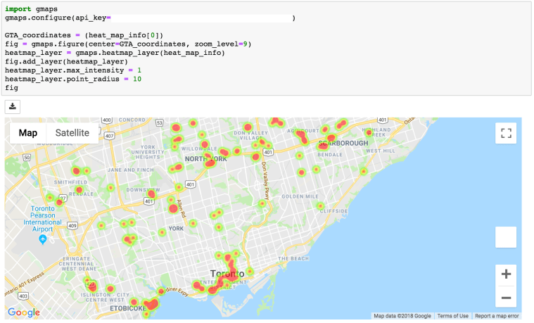
The disadvantage of using a heat map is that it does not function very well in a crowded area as it can highlight some of the important areas where there is a combination of condos that are new and old. In this case, you can zoom in to specific areas to find out which specific condos that are highlighted. The heat map is generally more efficient when the region is not too correlated and where it is easier to determine which condos are relatively older.

Screen Shot 2018-09-11 at 10.17.55 AM

Screen Shot 2018-09-12 at 11.59.06 PM

To overcome the cons of the heatmap, I had to come up with another map that can actually plot out the details information of condos. Before moving on, I want to find out the quantity of each number of bedrooms available on the market. I found out that there are more of 1 bed, 1 + den and 2 bedrooms available.


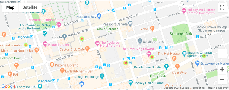
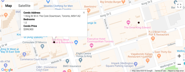
The first marker map is using gmaps, which is the same library I have used for the heat map. The content of the box can be either plain text or HTML format. I have used HTML format to label my marker into the style that is shown below. The marker within the map will have red circle dots for all the list of condos within the dataset. Once you click them, it will show the information on condo address, number of bedrooms and condo price.

Screen Shot 2018-09-12 at 11.36.22 PM.png

Screen Shot 2018-09-11 at 10.36.49 AM.png

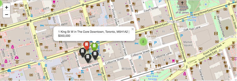
Although the marker map using gmaps library has a better visualization and neater formatting for the marker itself, it lacks in speed when comparing to the map using the Folium package. Folium package is another library that can be used to provide markers.  Even though it lacks in visualization, it does have higher speed and can add colors for markers to differentiate the condos based on the days on market. I have made the differences based on the pie graph shown before. The green marker being days on market less than 21 days, the red marker being days on market between 21 days to 40 days and black marker being days on market over 40 days.

Screen Shot 2018-09-11 at 10.37.40 AM


Conclusion:

In short, I have demonstrated an example of a web scraping project that uses BeautifulSoup package to parse the HTML data from online and visualize the sources on to numerous useful maps.

My next step is gathering more data to apply machine learning algorithms and create a useful user friendly analytical website.

Thank you!